Byggradarn design guidelines
The components an interface on the Byggradarn platform is built from, and how and when to use
each. Written the way Apple's Human Interface Guidelines are written: a component is described by
what it is for, what it must not be used for, and what a good one looks like — not by a page it
happens to appear on. Served as a site of its own — the rendered page at /, this text at
/design-guidelines.md for an agent that has been handed a URL — from
Byggradarn/design-guidelines-app, beside
the platform whose stylesheet it describes.
There is one implementation, the platform's stylesheet at <platform>/css/app.css, and one face,
Manrope, served from <platform>/fonts/ beside it. Link them and every class named here exists; the values in the
foundations below are what they hold. Both are served to any origin on purpose — a font is a
cross-origin fetch, and an app on its own domain gets Manrope only because the platform says so
in the header — so an app links the stylesheet by its full URL and vendors nothing. Where this
page and the stylesheet disagree, the stylesheet is right.
Foundations
The whole system
Five type sizes · three radii · two depths · one accent.
The smallness of those numbers is the design. A sixth size is one of the five plus a weight; a third depth is a surface that has not decided whether it floats. A system you can hold in your head is a system that gets followed.
What it serves: one decision at a time, large, on a quiet sheet. A screen shows one thing, at a size you read without leaning in, and everything else is one click away. Four principles follow:
- Content is the interface. Chrome recedes. Nothing decorative competes with what is read.
- One idea per screen, one primary action. Two things emphasised equally means neither is.
- Depth is meaning. A surface floats because it is temporary or modal, never for looks.
- Detail is a click away, never an unfolding. A row states the fact; the reasoning has a page.
Colour
Almost none. The page is near-monochrome so that the accent can mean exactly one thing: the answer — the figure, the date, the thing that was found out.
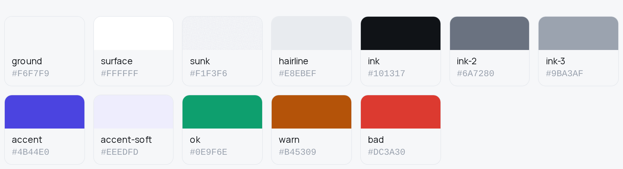
| Token | Value | Role |
|---|---|---|
--ground |
#F6F7F9 |
the desk: the page background |
--surface |
#FFFFFF |
the sheet: cards, lists, tables |
--sunk |
#F1F3F6 |
the well: fields, tags, hover, the selected item |
--hairline |
#E8EBEF |
the rule: row dividers and the ring around every surface |
--ink |
#101317 |
text, and the primary button |
--ink-2 |
#6A7280 |
secondary text: subtitles, dates, the ordinary tag |
--ink-3 |
#9BA3AF |
tertiary text: labels, captions, placeholders |
--accent |
#4B44E0 |
the answer: a value, a link, focus, the current rung |
--accent-soft |
#EEEDFD |
the accent as a tint |
--ok / --ok-soft |
#0E9F6E / #DFF5EC |
a state that is good |
--warn / --warn-soft |
#B45309 / #FCEFD9 |
a state that needs a look |
--bad / --bad-soft |
#DC3A30 / #FCE5E3 |
a state that is wrong; the destructive button |
--on-ink, --on-accent, --on-bad |
#FFFFFF |
text on a filled ink, accent or red |
Best practices
- Use the accent for the answer and for nothing else. A button, a heading or an icon wearing it competes with every figure on the page, and then the accent points at nothing.
- Keep status colour apart from the accent.
--ok,--warnand--badsay how something is; the accent says what it is. A red that is also the brand colour cannot warn. - Never let colour carry meaning alone. A state has a word beside its tone: Aktiv, not a green dot by itself.
- There is one theme and it is light. Declare
color-scheme: lightso native widgets follow.
Typography
Five sizes; the smallest is 15px. The face is Manrope, weights 400–800 from one variable file.
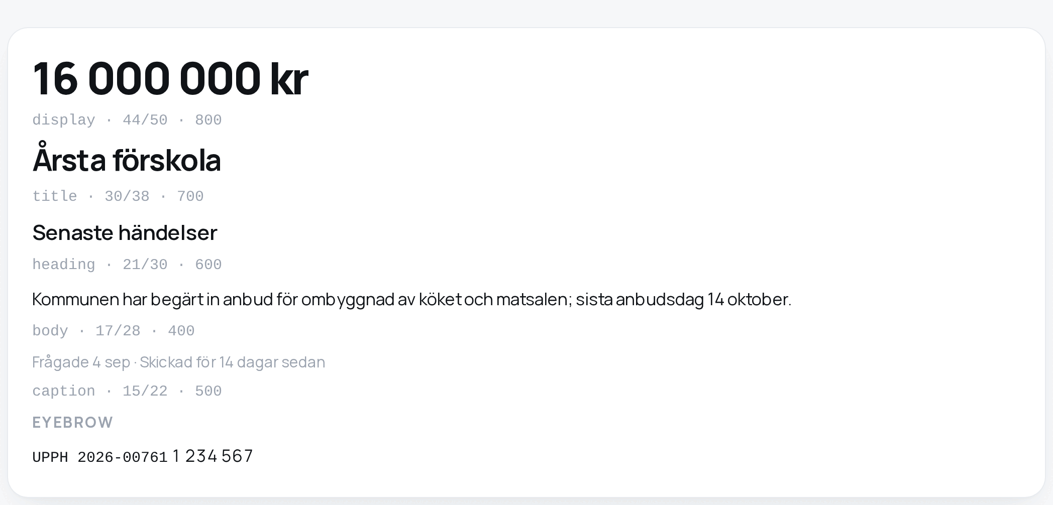
| Role | Size / line | Weight | Tracking | Class |
|---|---|---|---|---|
| Display | 44 / 50 | 800 | −0.03em | .t-display |
| Title | 30 / 38 | 700 | −0.02em | h1, .t-title |
| Heading | 21 / 30 | 600 | −0.01em | h2, .t-heading |
| Body | 17 / 28 | 400 | 0 | body, .t-body |
| Caption | 15 / 22 | 500 | 0 | .cap, .t-cap |
Four treatments that are not sizes: .sub (body, --ink-2, the line under a title), .cap
(caption, --ink-3), .eyebrow (caption, 700, uppercase, +0.06em, a label above a surface),
.mono (ui-monospace at caption size, for identifiers only). .num sets tabular figures.
Best practices
- Use Display for one figure that is the whole point of a screen, and never for two.
- Set every number in a column with
.num. A column of values that does not align reads as amateur. - Reserve
.monofor identifiers — organisationsnummer, upphandlings-ID, a CPV code, a case key. Never prose. - Do not invent a sixth size. Emphasis is a weight; density is less on the screen, not smaller text. There is no compact variant of anything.
Layout
Space is an 8-point grid: --sp-1 8 · --sp-2 16 · --sp-3 24 · --sp-4 32 · --sp-6 48 ·
--sp-8 64 · --sp-12 96, and --sp-half (4) for optical nudges. Space comes from gap in
flex and grid, never from margins on individual elements. A screen feels generous because of
--sp-6 and --sp-8 between sections, not because every gap grew.
Measure. --measure (760px) is the default column; --measure-wide (1080px) is for what
uses the window honestly: a table, a chart, and a screen whose halves sit side by side. A list
stretched across a wide monitor puts the action half a screen from the heading it belongs to. From 1200px both step up once, to
960px and 1400px, so a desk is not a phone column with white on either side; they are still
measures, not a share of the window. Prose does not follow: .prose is 80ch and .lede 46ch
whatever the page is.
Shape. Three radii: --r-control 12px for buttons, fields and nav items; --r-surface 20px
for cards, lists and the sheet; --r-full for pills. They nest concentrically: a 20px surface
with 24px of padding holds 12px controls, and the two curves stay parallel.
Depth. Two. A surface rests on the page (--rest) or floats over it (--float); there is no
third state because there is no third reason. Each is a hairline ring plus a shadow, and the ring
draws the edge — depth is never "a bigger blur".
Phone. Built for the small screen and widened at breakpoints. Below 640px a four-column row folds to two lines, the rail wraps, a table scrolls inside its surface. Nothing is hover-only.
Desk. From 1200px the measure steps up, and a screen with two halves puts them side by side
rather than one under the other — the copy beside what it introduces; a letter beside its panel
is .lanes, which has the room from 1000px. The extra width goes into layout, never into longer
lines.
Materials
Glass on the rail and the sheet, nowhere else: a tinted translucent fill, a blur, saturation lifted so colour survives the blur, and a specular edge — all four, or it is a grey rectangle. Content sits on opaque surfaces, because a table of figures over a live blur shifts as the page scrolls behind it, and small text over varying luminance loses contrast exactly where somebody is checking a number.
Motion
Things settle rather than stop. --ease (cubic-bezier(0.32, 0.72, 0, 1)) decelerates late;
--dur-fast (140ms) is for anything under the pointer, --dur-base (280ms) for something
arriving, --dur-slow (480ms) for something arriving from below the fold as it is scrolled to.
Nothing longer than that; nothing that moves without explaining a relationship.
- Screen entry. The page's first children rise 8px and fade in, staggered — on page load only. A fragment that updates swaps inside a container the page keeps, so it never replays.
- Work, then done. A button that submits shows a spinner in place of its label and keeps its width. The completion is drawn by the page that comes back, not by the browser that sent the request.
- A list that updates in front of somebody pairs its rows. Give each row a
view-transition-name; rows that were already there glide, and the new one is the only thing that appears. prefers-reduced-motion: reduceis honoured everywhere — and honouring it means giving back the finished state, not only stopping the movement.
Writing
Interface copy is Swedish; the voice is direct, concrete and short. These rules bind as tightly as the type scale, because copy is the part of an interface that drifts fastest.
| Rule | Yes | No |
|---|---|---|
| A label names, a button acts | Investeringsvolym · Skicka begäran | Skicka · OK |
| Say the fact, not the sentence about it | 9 uppgifter saknas | Ingen begäran har skickats, och projekten saknar uppgifter |
| Under eight words, or none | Kommunen som frågat oss står först. | a paragraph under a title |
| Never explain the interface in the interface | — | Ett steg per kommun, det som väntar på någon först |
| No commentary, no first person | Senast 18 sep | Plattformen skriver, du avgör |
| Reasons are evidence | Frågade 4 sep · Skickad för 14 dagar sedan | Vi väntar fortfarande på svar |
| Absolute dates for anything actionable | Sista anbudsdag 14 oktober | om 3 dagar |
| Money in kronor, grouped, no decimals | 16 000 000 kr | 16000000.00 SEK |
| Sentence case; no terminal period on a fragment | Senast hört | Senast Hört. |
| The reader's vocabulary | begäran, utskick, skede | ingest, datapoint, event |
Before shipping a screen, read every string on it aloud and delete the ones that explain rather than inform. A card carrying more than one sentence is almost always carrying an argument that belongs in documentation.
Tone of voice
Friendly, and to the point. Where the product speaks to a person rather than labels a value: the front door, a notification mail, an empty state's one line, an app's own screens. The model is a Swedish bank's site: du to the reader, vi for the company, one idea per sentence, and the benefit said as the thing the reader can do next. Warm because it is plain, never because it is chatty.
| Rule | Yes | No |
|---|---|---|
| Du to the reader, vi for us | Du får veta när ett projekt ändras | Användaren notifieras vid förändring |
| One idea per sentence; two sentences at most | Se när projektet ändras. Logga in. | a paragraph that keeps going |
| No antithesis. Say what it is, never what it is not | Ledtiderna är antaganden | Ledtiderna är antaganden, inte mätvärden · Inte en lista, en radar |
| No dashes as a pause. A dash that opens an aside is a sentence that wanted to be two | Kommunernas handlingar: budgetar, planer och protokoll. | Kommunernas handlingar — budgetar, planer, protokoll — läses dagligen |
| The en dash stays for a range | 1–5 år · 6–18 mån | 1-5 år |
| A button is a verb in the imperative | Logga in · Räkna ut · Boka möte | Klicka här · Inloggning |
| No exclamation marks, no questions the reader does not answer | Välkommen tillbaka | Välkommen tillbaka! · Redo att komma igång? |
| A number leads, with the date it holds from | 8 % från 1 september 2026 | en högre ränta än tidigare |
| Swedish where a Swedish word exists | utlysning, bevakning, begäran | call, monitoring, request |
Antithesis and the dash are singled out because they are how copy argues. Not a list, a radar compares the product to something the reader never mentioned; the dash smuggles a second thought into a sentence that had finished. Both read as clever once and as effort every time after. State the fact and stop.
The interface itself keeps the stricter rules above: it states facts and has no voice of its own, so vi and du do not appear on a label or a row. The tone applies the moment the product addresses somebody, and the two are one register at two volumes.
Accessibility
- Contrast at least 4.5:1 for text and 3:1 for large text and meaningful graphics. The tokens meet it; a colour that is not a token probably does not.
- Everything reachable by keyboard, in a logical order, with a visible focus ring.
outline: nonewithout a replacement is a bug. - Minimum hit target 44×44px, however small the glyph looks.
- Real semantic HTML: a
divwith a click handler is not a button; a row that navigates is an<a>. A decorative glyph isaria-hidden; a meaningful one carries text. - The interface survives 200% zoom without horizontal scrolling.
Components
Everything on screen is one of these. Reaching for something that is not here means the
catalogue is missing a component — add one rather than styling a div on a page. A class the
stylesheet does not define is dropped by the browser in silence; the element simply has no
padding or no colour, and nothing tells you.
Rail
The one piece of chrome: a bar across the top, on glass, holding the wordmark, the destinations, and the account controls.

Use it as the only navigation. A destination is a place a person goes to work; a handful of
them, in a fixed order. On the front door the same rail carries no destinations at all, only
the wordmark and two buttons on the trailing edge — .btn.btn-plain.btn-sm Logga in and the
aurora Boka demo: the two things a stranger came to do, and the only .btns a rail carries;
the console's own controls there are icons.
Do not use it as a sidebar, a dashboard or a place for counts. A column down the side spends 228px of every screen on six words; a number in the rail competes with every figure on the page for the one thing the accent means.
Anatomy. .wordmark on the leading edge (caption size, 800, the second half in the accent —
the only decorative accent in the product, and it is eleven letters). .nav with one <a> per
destination; the current one carries aria-current="page" and is drawn as a --sunk pill, never
underlined, never in the accent. A destination that is also a queue adds .nav-dotted and
carries an .inline-dot beside its word when something there is waiting — never a number, which
is a decision nobody makes from the rail. .grow to push the rest to the trailing edge.
.icon-btn for the three account controls — notices, settings, sign out — with .icon-dot over
the notices icon when any are unread.
<header class="rail">
  <a class="wordmark" href="/">Bygg<span>radarn</span></a>
  <nav class="nav" aria-label="Huvudmeny">
    <a href="/data" aria-current="page">Data</a>
    <a href="/ko" class="nav-dotted">Kö<span class="inline-dot"></span></a>
  </nav>
  <span class="grow"></span>
  <a class="icon-btn" href="/notiser" title="Notiser" aria-label="Notiser">
    <svg viewBox="0 0 24 24" fill="none" aria-hidden="true">…</svg>
    <span class="icon-dot"></span>
  </a>
</header>
Best practices
- An icon-only control carries its name in both
aria-labelandtitle: a pointer gets the tooltip and a screen reader gets the same words. An icon only one of them can read is half a control. - A dot says something is waiting; it is never a number. How many is not a decision anybody makes from the rail — that there are any is.
- The rail is sticky and content passes under it. It is the only glass apart from the sheet.
Page and head
.page is the measure with --sp-6 above and --sp-12 below; .page.page-wide is the wide
measure. Its first child is .head: what the screen is, and at most one control.
Use the head for a title, at most one line under it, and at most one control on the trailing edge.
Do not put a paragraph under the title, repeat what the rail already says, or place two controls of equal weight. A screen that needs a sentence to justify its layout has a layout problem, and the sentence is not the fix.
<main class="page">
  <div class="head">
    <div class="grow">
      <h1>Årsta förskola</h1>
      <p class="sub">projekt · <span class="mono">71830001</span></p>
    </div>
    <button class="chip chip-add">Följ</button>
  </div>
  …
</main>
Display figure. When one number is the screen — two open calls, a month's spend — it goes
at display size in the head, with its label in .eyebrow above and the qualification in .cap
below, and what follows is the shape under it, not a second figure beside it.
Back control
.back: a chevron and the name of the destination it returns to.
Use it on any screen that is reached from another. Label it with the destination — Projekt — never Tillbaka, which tells nobody where they are about to land. A top-level destination has no back control.
<a class="back" href="/projekt">
  <svg class="chevron" viewBox="0 0 7 12" fill="none" aria-hidden="true">…</svg> Projekt
</a>
Surface
.surface: one sheet — white, --r-surface, resting depth. Add .pad when its children are
prose or a form; add .list when they are rows.
Use one surface per subject. A list of like things is one surface with hairline rows. Separate surfaces are for separate subjects.
Do not stack cards with gaps between them for one list — nine cards is nine shadows and nine edges, and the eye counts containers instead of reading rows. Do not put a surface inside a surface: it draws the ring and the shadow twice. A lone actionable row is a list with one row in it.
Grouped list and row
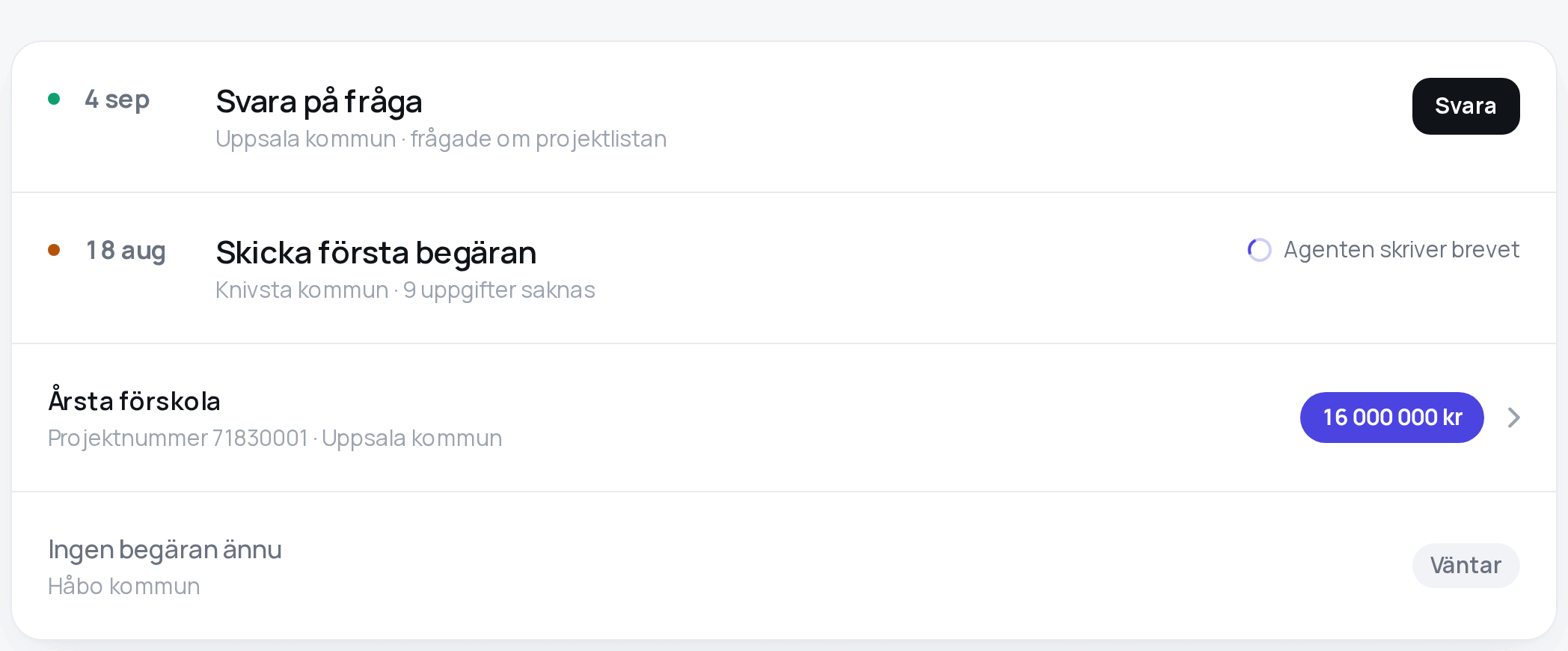
.surface.list holding .item rows, separated by hairlines.
Use it for like things: projects, kommuner, letters, sources. A row carries, in this order: a dot when something is waiting; the heading; one line of evidence; and on the trailing edge either a value or one button.
Do not put a value and a button on one row, or two of either. Do not put an element between
.list and .item — an <li>, a wrapper — because the child selector that draws the hairlines
stops at it. Do not give a row .surface.
Anatomy. .item-title is the heading (body size, 600); .item-sub the evidence (caption,
--ink-3); .grow holds both. A row that navigates is an <a> and ends in .chevron; a row
that does not, does not get one — the chevron is the only part of a clickable row visible before
the pointer arrives, and on a touch screen there is no hover to discover it with. .item-quiet
dims a row that is not actionable. .clamp cuts a summary at two lines when the whole text is one
click away.
<div class="surface list">
  <a class="item" href="/projekt/1">
    <div class="grow">
      <span class="item-title">Årsta förskola</span>
      <span class="item-sub">Projektnummer 71830001 · Uppsala kommun</span>
    </div>
    <span class="value">16 000 000 kr</span>
    <svg class="chevron" viewBox="0 0 7 12" fill="none" aria-hidden="true">
      <path d="M1 1l5 5-5 5" stroke="currentColor" stroke-width="1.8" stroke-linecap="round" stroke-linejoin="round"/>
    </svg>
  </a>
</div>
A row with a date is a grid, not a paragraph: .item.item-cols lays out four columns — the
state dot, the date (.item-when), the body, and what to do about it — aligned to the top so
every column's first line shares the title's line box. A date given a minimum width inside a
paragraph is not a column; the prose wraps underneath it. On a phone the four columns fold to two
lines.
<article class="item item-cols">
  <span class="dot dot-ready" aria-hidden="true"></span>
  <span class="item-when">4 sep</span>
  <div class="item-body">
    <h2 class="item-title">Svara på frågan</h2>
    <p class="item-sub">Uppsala kommun · Vilken typ av avtal är ni intresserade av?</p>
  </div>
  <a class="btn btn-sm" href="…">Svara</a>
</article>
Best practices
- In a queue, the heading is what to do — Skicka första begäran — not what the thing is called; the subject and the evidence qualify it on the second line.
- Everything that justifies the action is on the row, in one line, or it is not on this screen. A page you read is not a page you unfold.
- A row that is waiting on something the reader did not start shows the working indicator in the button's place, the same height, so the row does not jump when the button arrives.
Notification row and bell
What the platform, or the app itself, told this person — read from GET /api/notifications —
and the one control that says there is something to read.
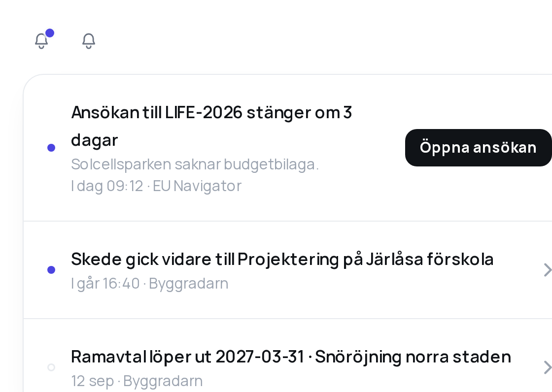
Use it for the list an app shows from the bell: one row per notification, newest first, the
unread ones marked. The bell is an .icon-btn in the rail with .icon-dot over it while
anything is unread.
Do not put a number on the bell — a dot says something is waiting, and how many is not a decision anybody makes from the rail. Do not show the same notification twice because it came on two channels; the API lists the in-app row only. Do not invent a link for a notification that has no target: a row with nowhere to lead stays inert rather than pretending otherwise.
Anatomy. A .surface.list of .item rows. Leading: .dot.dot-accent for unread,
.dot.dot-read for read — hollow, so the column stays a column. .item-title is the
notification's title; .item-sub.clamp its body, cut at two lines; a second .item-sub with
when and from whom — the app the notification belongs to, or Byggradarn for the platform's
own. Trailing: what pressing it does. A row whose target the app can open is an <a> to the
app's own route for that kind and id, ending in .chevron; a row with actions is an
<article> with one .btn.btn-sm for the first action, the rest one click away. Pressing
either reports back through POST /api/notifications/{id}/acted, so a second device shows it
done.
<div class="surface list">
  <article class="item">
    <span class="dot dot-accent" aria-hidden="true"></span>
    <div class="grow">
      <div class="item-title">Ansökan till LIFE-2026 stänger om 3 dagar</div>
      <div class="item-sub clamp">Solcellsparken saknar budgetbilaga.</div>
      <div class="item-sub">I dag 09:12 · EU Navigator</div>
    </div>
    <a class="btn btn-sm" href="/ansokan/4711">Öppna ansökan</a>
  </article>
  <a class="item" href="/projekt/41">
    <span class="dot dot-read" aria-hidden="true"></span>
    <div class="grow">
      <div class="item-title">Skede gick vidare till Projektering på Järlåsa förskola</div>
      <div class="item-sub">I går 16:40 · Byggradarn</div>
    </div>
    <svg class="chevron" viewBox="0 0 7 12" fill="none" aria-hidden="true">…</svg>
  </a>
</div>
Best practices
- The title is the whole message — Skede gick vidare till Projektering på Järlåsa förskola — and the body is what a person reads only if the title made them. Do not repeat the title in the body.
- The route a target opens is the app's to decide; the platform sends a
kindand anid, never a URL. Akindthe app does not know gets a row with no link, not a broken one. - The settings screen is a form over
GET/PUT /api/me/notifications/settings: switches for the account, and one row per app the account holds. Write the whole object back; a switch the screen does not show is its default.
Button
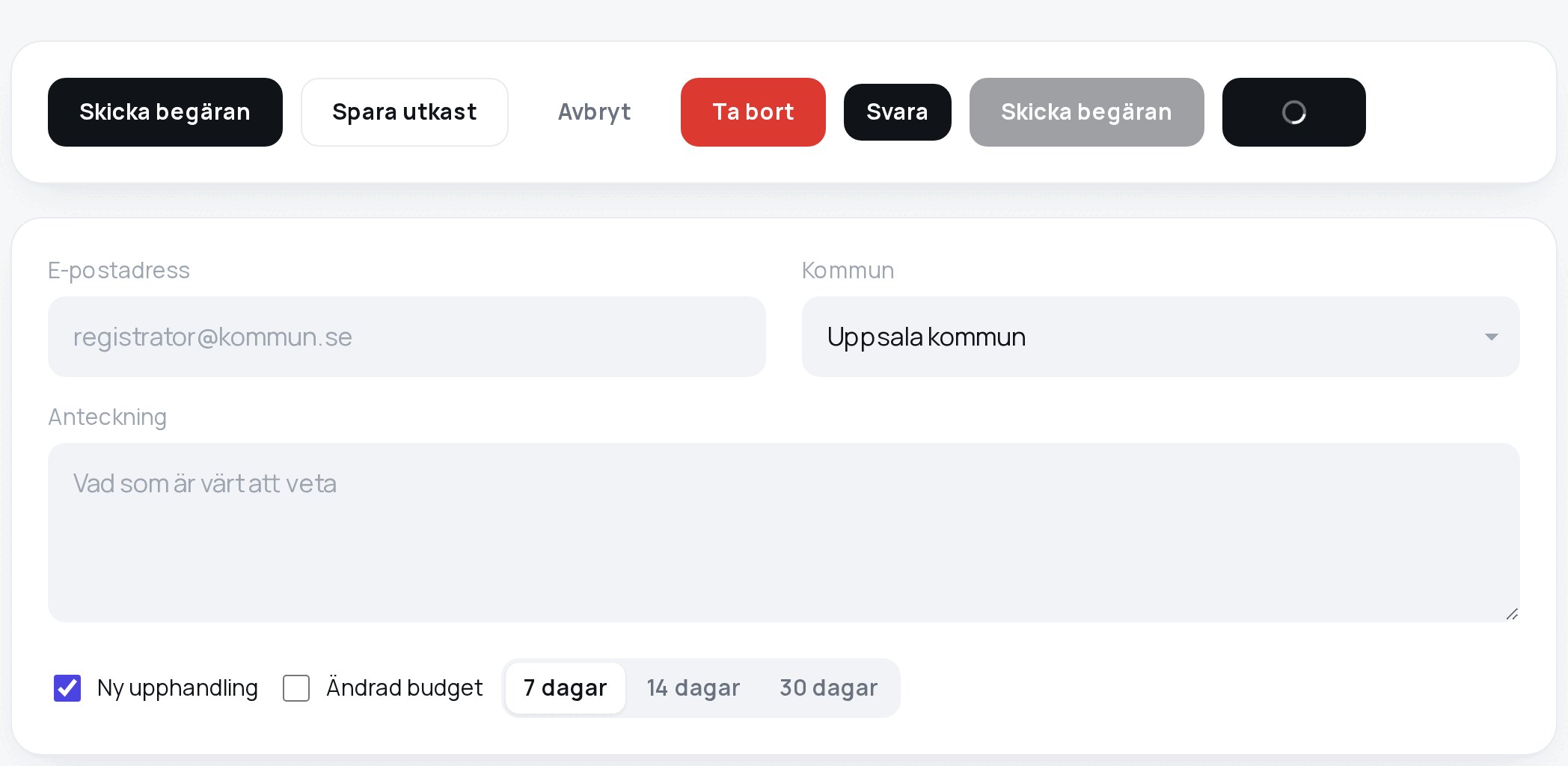
Buttons carry consequence, not looks. Four weights, chosen by what pressing does.
| Class | Weight | Use it for |
|---|---|---|
.btn |
filled ink | the one action the screen exists for |
.btn.btn-plain |
hairline | the ordinary alternative |
.btn.btn-ghost |
no fill | reachable, but should not be reached for |
.btn.btn-bad |
filled red | only inside a sheet that has already asked |
.btn-sm is any of them at row size. [disabled] dims to 40%. .is-busy hides the label behind
a spinner and keeps the width.
.btn.btn-aurora is the filled button with a ring of three lights turning behind it and a
highlight that sweeps across it — the one exception to Deliberately unused below, for the one
action on the sales page, and nowhere else: ADR 0050.
An app does not use it.
Use one filled button per screen. The filled button is ink, not accent.
Do not use .btn-bad outside a sheet — a red button on a page is a question nobody was asked.
Do not use a button where a link would do; a button performs, a link goes.
Best practices
- A button says what happens — Skicka begäran, Spara utkast — never OK, never Skicka alone when what is sent matters. After the action, the confirmation uses the same verb.
- Buttons in a group are
.actions, wrapping,--sp-1apart. - The button that submits and waits shows
.is-busy; the completion mark is drawn by the page that comes back.
Field
.field: a well. Recessed in --sunk, no border until focus, then a white fill, an accent ring
and a soft glow. Flat against a flat surface, only the fill distinguishes an input from a label.
Use it for every text input, select and textarea. A select is the same well with a
chevron drawn in; a textarea is 120px tall and resizes vertically.
Anatomy. A <label> above the field, caption size in --ink-3, a noun phrase. A placeholder
names the scope or the shape of the input — registrator@kommun.se, Sök titel, köpare eller
CPV — not the label again.
<label for="epost">E-postadress</label>
<input class="field" id="epost" type="email" placeholder="registrator@kommun.se">
Search field. The same .field with type="search", on the rail's trailing edge, with a
placeholder that names what it covers. Results refine as the person types, after a 250ms debounce.
Filters. A row of fields that narrow a list is .filters: a grid that wraps rather than
scrolls, on its own surface above the list. Never combine .filters and .row on one element.
Checkbox
.check: the native checkbox with accent-color: var(--accent) beside its label.
Use it for a list of independent on/off settings — which notifications to receive, which
apps to show. State is the tick, never a colour alone. For a two-line label use
.check-block, which puts the box on the first line rather than in the middle of the block.
<label class="check"><input type="checkbox" checked> Ny upphandling</label>Switch
.switch: one choice from closely related options that change the view.
Use it for a chart's range, a screen's tabs, a sort. Equal segments, nouns, well under seven. Selection is a raised white segment and weight, not colour alone.
Do not mix view segments with action segments in one control, and do not use it for a setting that persists — that is a checkbox.
<div class="switch">
  <a href="?dagar=7" aria-current="page">7 dagar</a>
  <a href="?dagar=14">14 dagar</a>
  <a href="?dagar=30">30 dagar</a>
</div>
Value
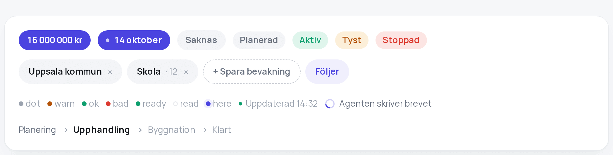
.value: the answer, on the trailing edge of a row — the figure, the date, the thing that was
found out. The only filled accent on a page.
Use one per row, and only for what the row exists to tell. .value-quiet is the same pill in
--sunk for a row whose answer is nothing yet — Saknas, a zero. .value-dot inside it is a
qualification without a word.
Do not put two values on a row (neither is the answer), use it for a state (that is a tag), or use it for something the reader put in (that is a chip). Do not put it on a button.
Best practices
- Tabular figures, and money grouped with non-breaking spaces so 8 000 000 kr never splits.
- It wraps rather than overflows; a long value is capped at 60% of the row.
Tag
.tag, .tag-ok, .tag-warn, .tag-bad: a state the system reports and nobody can remove.
Use it for Aktiv, Tyst, Stoppad, Planerad — a fact about the thing, in a word, with its state colour as text on a tint. On a row it sits on the evidence line, beside the words.
Do not put it in the accent, make it clickable, or use it where the reader can change what it says — that is a chip.
Chip
.chip: a value somebody put in and can take out again — a filter, an address, a file.
Use it wherever the reader's own choices are shown back to them. It carries its own cross
(.chip-x). .chip-add is the same capsule as a dashed outline: an empty slot waiting, not
another button. .chip-on is a pressed chip in the accent tint.
A chip that toggles changes its word, not an attribute: Följ becomes Följer. The word
carries the state, so there is no aria-pressed — a label that changes and an attribute that
changes would announce the same fact twice.
<div class="chips">
  <span class="chip">Uppsala kommun <button class="chip-x" aria-label="Ta bort">×</button></span>
  <button class="chip chip-add">+ Spara bevakning</button>
</div>
Dot
.dot: urgency, where a page of similar rows cannot show it by order.
| Class | Meaning |
|---|---|
.dot |
attention, unqualified |
.dot.dot-warn, .dot-bad, .dot-ok, .dot-accent |
attention, with a tone |
.dot.dot-ready |
go: ready for you now. Breathes once every two seconds. Green because the row is go, not because something is well |
.dot.dot-read |
read, as against unread. Hollow rather than absent, so the column stays a column |
.dot.here, .dot.filled |
the rung a thing is at, and the rungs behind it |
Best practices
- The tone is decided by the code that knows the state — one place knows what a state is called and what colour says so — never in a template.
- A dot is 8px;
.inline-dotis the same statement beside a word,.icon-dotover an icon. - Only
.dot-readymoves, and it is the only moving thing on a page of still rows. A pulse loud enough to notice from across the desk is one you stop seeing by lunchtime.
Live and working indicators
.live: a green .live-dot and a server-rendered timestamp — Uppdaterad 14:32.
Use it where a page follows along by itself. The timestamp is the point: an animation alone is theatre; a clock that moves because the server sent a new one is evidence.
.working: a .spinner and a sentence — Agenten skriver brevet.
Use the sentence where the work is neither instant nor started by the reader, so the words say who is doing what and the spinner is confirmation. Use the bare spinner where the work is a direct answer to something the person just did; Laddar… beside it adds nothing.
Ladder
.ladder of .rungs: a row of stages with the current one in ink (.rung-now) and the passed
ones dimmed (.rung-done).
Use it for a thing that moves through named phases in order — a project's skede. Do not use it for steps a person performs; that is a queue.
Stat
.surface.stats > .stat > .stat-value + .stat-label: one figure that answers one question.
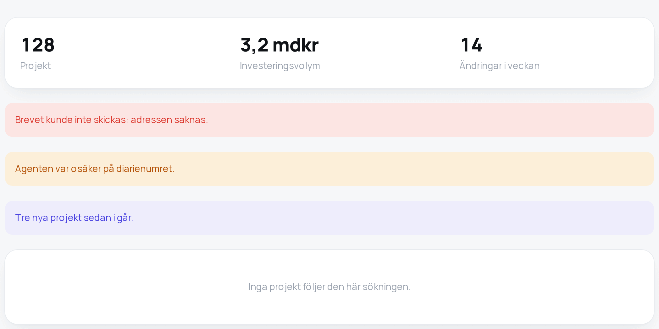
Use it in a row of two to four, each a title-size number in 800 with tabular figures and a caption label under it. No tile, no gradient, no icon: the number is the thing.
Do not put six on a screen. Six figures is a dashboard, and a dashboard is what this system is not.
Note
.note, .note-bad, .note-warn, .note-accent: one sentence on a tint.
Use it for what went wrong, what the agent was unsure of, or what is new since last time. Errors say what went wrong and what to do about it — no apologies, no "något gick fel".
Do not use it to explain the interface. If a screen needs a note to be understood, the screen is wrong.
Empty state
.surface.empty: centred, --ink-2, one line, and a .btn-plain if there is somewhere to go.
Every list has one, saying what will appear there and how to make it appear. A list that renders as nothing looks broken; an empty table with a spinner that has finished is a dead end.
Table
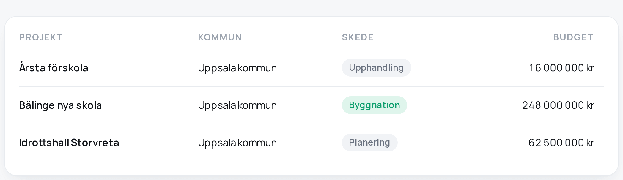
.table inside .surface.pad.scroll, on the wide measure.
Use it only when rows are genuinely compared column by column — a value against a value, a date against a date. Otherwise it is a grouped list.
Anatomy. Headings in eyebrow style; rows separated by hairlines and hovering to --sunk;
numbers right-aligned and tabular (.num); a sortable heading is a <button> with a
.sort-arrow that appears on hover.
<div class="surface pad scroll">
  <table class="table">
    <thead><tr><th>Projekt</th><th>Kommun</th><th class="num">Budget</th></tr></thead>
    <tbody>
      <tr><td><a href="/projekt/1">Årsta förskola</a></td><td>Uppsala kommun</td><td class="num">16 000 000 kr</td></tr>
    </tbody>
  </table>
</div>
Do not use a bare <table> — it has no head treatment, no hairlines and no tabular figures,
and renders as whatever the browser thinks a table is. Do not let a table widen the page: it
scrolls inside its surface, and the page body never scrolls sideways.
Sheet

<dialog class="sheet">: asking before something cannot be taken back.
Use it for exactly that — sending, deleting, anything irreversible — and for reading
something long that does not belong on the page (.sheet-wide).
Do not use it to collect a form that could sit on the page, or to confirm something reversible. Asking twice for what can be undone teaches people to click through.
Anatomy. A native <dialog>, so the browser supplies what a hand-built overlay gets wrong:
the page goes inert, focus is trapped and restored, Esc closes it. .sheet-form holds an <h2>
that asks the question, a .cap that states the cost, and .sheet-actions with cancel first in
the source (so the keyboard reaches it first) and the confirming button last, where the pointer
expects the default. It floats (--float) on glass over a dimmed page — the only surface that
ever does.
<dialog class="sheet" id="skicka" aria-labelledby="skicka-title">
  <form method="post" action="…" class="sheet-form">
    <h2 id="skicka-title">Skicka begäran till Uppsala kommun?</h2>
    <p class="cap">Brevet går till registrator@uppsala.se och kan inte tas tillbaka.</p>
    <div class="sheet-actions">
      <button class="btn btn-plain" type="button" data-sheet-close>Avbryt</button>
      <button class="btn" type="submit">Skicka begäran</button>
    </div>
  </form>
</dialog>
Best practices
- The question is in the title and the cost is in the sentence under it, because a person reading one line reads the title.
- A destructive confirmation is
.btn-bad; this is the only place it appears.
Disclosure
<details> with a styled <summary>: the evidence behind a decision, expanded in place.
Use it for what a person might want to check — the reasoning, the source, the prompt. Closed by default; keyboard-reachable and announced without a line of script.
Do not hide behind it anything a person must read before acting. And do not confuse it with the chevron on a row: that one leads somewhere else, this one opens here, and the difference matters to somebody deciding whether they are about to lose their place.
Footer
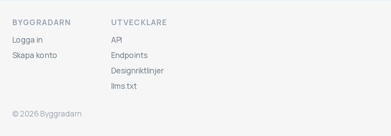
.foot under the page, on the ground, above a hairline: link groups under eyebrows, in caption
size, and one line of who this is.
Use it on a page a stranger reaches: the front door, a public document. It is where everything else is, for somebody who has read to the end and wants the next place.
Do not put it on a console screen or an app's working screens: a session has the rail, and a footer under a working list is a second navigation nobody scrolls to. Do not put a sentence in it. A footer that explains is a page that did not.
Anatomy. .foot-inner on the measure, with the page's own side padding so the groups sit on
its left edge. .foot-groups is a grid of .foot-groups: an .eyebrow naming the group, then
links, each on its own line. The last line is .cap: the name and the year.
<footer class="foot">
  <div class="foot-inner">
    <div class="foot-groups">
      <div class="foot-group">
        <p class="eyebrow">Utvecklare</p>
        <a href="/developers">API</a>
        <a href="/developers/design">Designriktlinjer</a>
      </div>
    </div>
    <p class="cap">© 2026 Byggradarn</p>
  </div>
</footer>
Best practices
- Every link leads somewhere the reader may go without signing in. A door painted on a wall is worse than no door.
- Two or three groups. A footer with six is a sitemap, and a sitemap is a sign the pages above it have no order.
Two lanes
.lanes with .lane-aside: the action and its trail on the left, what accompanies it on the
right — a letter beside the automation that wrote it, a thread beside its attachments.
Use it when a screen has one thing being done and one set of things that inform it. Above 1000px they sit side by side; below, the aside follows. Do not use it to put two groups of equal weight beside each other — that is a split — or two subjects; that is two screens.
Split
.split: two groups of one screen, of equal standing, one under the other on a phone and side by
side from 1200px — what waits and whether the platform runs, a list and the form that adds to it,
the groups of a health page. A .note inside it, or anything marked .span, takes the whole row.
<div class="split">
  <div class="surface list">…</div>
  <div class="surface pad">…the form…</div>
  <div class="surface scroll span"><table class="table">…</table></div>
</div>
Use it when a screen is read in a glance rather than a scroll, and the two halves are halves of one subject. Do not use it for the action and what accompanies it — that is lanes — or to put two screens on one page. A hub of destinations is one list, on the measure, however wide the window: a list with nothing to sit beside stays a list.
App frame
.frame: a window bar (.frame-bar with .frame-dots, a .frame-title and, on a sales page,
a .tag saying Exempel), an optional .frame-head, and inside it the product's own rows —
a .list of .items, values, dots — drawn by the same components and the same stylesheet.
The product as its own picture: what a screenshot would show, without a screenshot to go
stale. It floats (--float), because it is a window over the page.
Use it where a page wants to show what an application looks like — the front door's application cards and examples are the model — and put real components in it, never an image of them. Rows in a frame on the front door arrive one after another as the frame is scrolled to. Do not use a photograph, a screenshot, an illustration or an icon for meaning; and do not put a surface inside a frame — the frame is the surface.
Contents
.docs with .contents before .prose: a long document and, from 1200px, its second-level
headings in a sticky column beside it, each a link to the heading's id. Below that width the
column is not drawn and the document reads top to bottom.
Use it for a document long enough to need a map — the developer pages are the model — and build the list from the document's own headings, never by hand. Do not use it as navigation between pages; that is the rail.
Deliberately unused
Reaching for a control because it exists, rather than because the data needs it, is how an interface stops feeling native. None of these are in the system, and adding one is a decision:
- A sidebar. Navigation is a handful of destinations across the top.
- A dark theme. One palette, designed once. The front door's closing band is drawn on ink with five tokens of its own — ADR 0051 — and is a band on one page, not a theme.
- Cards in a grid. A list of like things is one surface; separate subjects are separate surfaces, stacked.
- Toasts and banners. What happened is on the page that comes back, in a note or in the row that changed.
- Tooltips as explanation. A control that needs one has the wrong label.
- Icons for meaning. Three account icons in the rail, named. Everywhere else, a word.
- Progress bars. Nothing here knows its own duration; a determinate indicator would be a guess drawn as a fact.
- Modals for forms. A form is on the page; a sheet asks a question.
- Accent buttons, gradients, glows, drop shadows on text or charts. The accent is the answer;
depth is two shadows; a chart line is thin and unsmoothed. The one glow there is,
.btn-aurora, is the sales page's call to action and is recorded as the exception in ADR 0050.